Wednesday, October 31, 2012

Make It Monday #89 - Creating Windows for Floating Images

There is another great Make It Monday challenge on Nichole Heady's blog for Papertrey Ink. Check out Nichole's video demonstrating how to make a window card with a floating image.

I think this is one of those techniques that is looks a lot harder than it actually is, leaving friends & family pretty impressed with your skills.


I used the PTI Tag Sale #4 die to create an ornament shaped cut in the white cardstock and a Spellbinders Nestabilities die to cut a circle in the red cardstock card base.

The clear transparancy piece is sandwiched between the two cardstock pieces, and then the Martha Stewart punched snowflakes are centered in the middle of the clear circle. A gemstone adds a touch of sparkle to the front of the card - it was hard, but I resisted adding anything more, really wanting to keep it CAS.


I inked a sentiment from PTI's Happiest of Holidays with Color Box Cranberry and stamped the center of a white cardstock panel. A few small red snowflakes with gem centers finish the inside of the card.

It was hard to get a photo of showing both sides of the card from the inside - somehow I have a lot of reflection going on here.


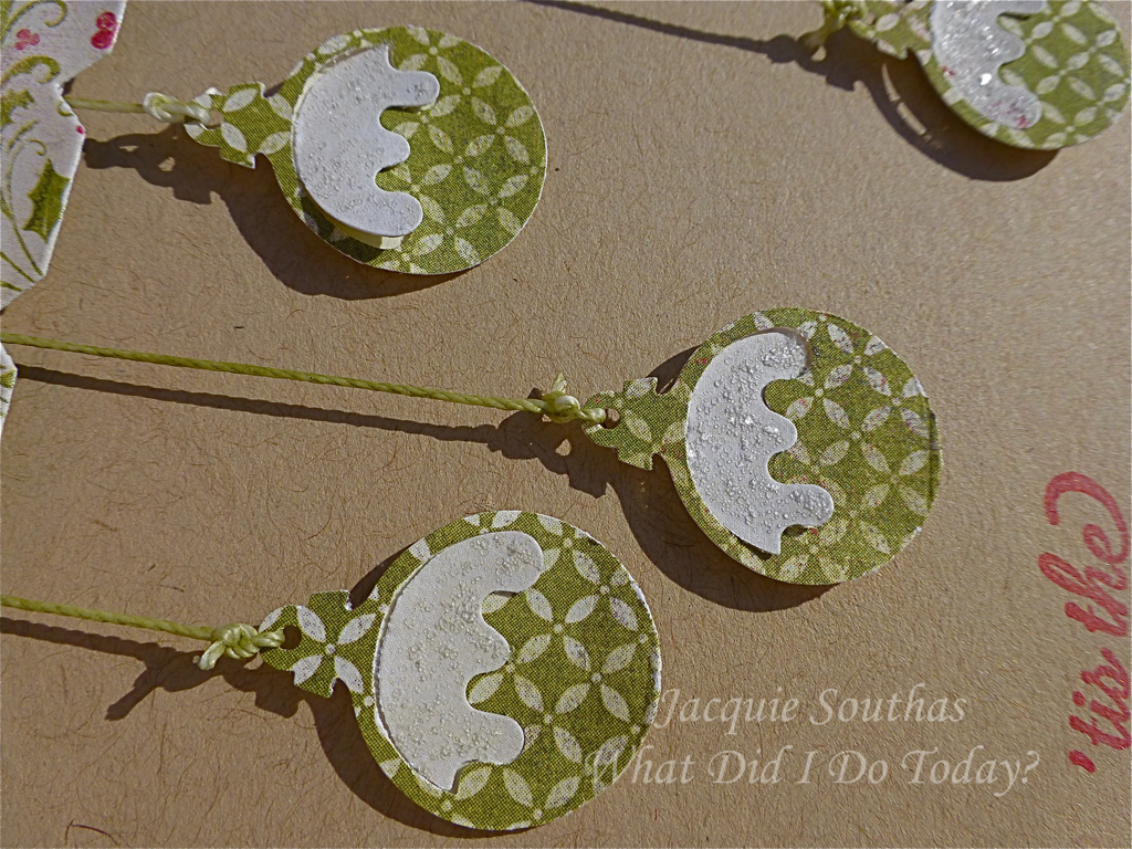
Like so many others participating in MIM this week, I used the extra pieces to create a couple of tags. I have two, because I initially had my colors reversed, but decided to go with the red card base. The tag sentiment is from the PTI Santa Stationery stamp set.


Please don't ask me why I didn't make the card in a more snow traditional palette of blue and white - I have no idea LOL.

Have a safe & happy Halloween for those able to go out tonight. Thankfully, our family & friends on the East Coast have survived Sandy reasonably well, but my heart goes out to those facing the long, difficult road of rebuilding their communities.

Thanks for stopping by,

Jacquie


Tuesday, October 30, 2012

Moxie Fab World Alphabet Sticker Challenge

My dear son loves to play soccer, and I love watching him play soccer, but I am a little thankful when the season is done.

Team Half & Half (named by the coach because half the team was a head taller than the other half - seriously, it was one or the other) had a great season and finished by winning the division championship this past weekend. This meant a pizza party & celebration tonight. As the team manager, I put together a little thank you for the coach, including this quick card.


Even when I knew for months I'd need a coach thank you card, it wasn't until the afternoon of the party that it was produced {sigh}.

I had been thinking for a while about what I wanted to do - it definitely had to be masculine and meet the approval of the teen boys, so when I saw the Moxie Fab World Alphabet Stickers Challenge a plan started to form in my mind.

The team colors were grey & blue, and I found a pack of charcoal fabric Dolce Thickers in my stash. There were enough letters to spell out "Team Half & Half", which fit on three strips of blue cardstock across the front of the card.


For the inside of the card I used two Papertrey Ink dies to finish the message "thank you". As I was picking up the dear kids after school, mentally going over my checklist of what was needed for the evening, I realized the card read "Team Half & Half Thank You" - oops.

The "thank" had come from a "thankful" die cut that was trimmed down, so I die cut "blessed" from the same set to get an "s" to create the word "thanks". I didn't have time to take another photo before the boys started signing the card, but it does now say "Team Half & Half Thanks You".

I love the image of the soccer player inked with Memento London Fog. This is from an older Art Warehouse set that is pulled out every soccer season.

Thanks for stopping by,

Jacquie


Friday, October 26, 2012

Tuesday Trigger - Val de Victorian Take Two

This is my second card inspired by the Tuesday Trigger: Val de Victorian at Moxie Fab World. I love the images Cath finds!


I focused on the textures of the houses this time.


I used a Tim Holtz brick wall embossing folder with brown/pink Coredinations paper and sanded it to expose the pink core. A piece of purple cardstock was embossed with a Paper Studio folder to mimic the wood siding usually found on Victorian homes. The window panes inspired me to stamp and heat emboss the pink panel with a Library Ledger stamp from Papertrey Ink.

I adhered the three panels to a piece of scrap paper and then cut the whole piece on the diagonal. My original plan was to stop here, but it just didn't look finished.

I cut a few strips of Crate Paper designer paper with a My Favorite Things Squiggle Border die. All the edges are inked with Vintage Photo Distress Ink.

This versatile sentiment is from the PTI Mega Mixed Messages stamp set.

In the end I love the card, but think it looks more like a series of highrise condo's than the Victoria houses in the Trigger!

Thanks for stopping by,

Jacquie


Thursday, October 25, 2012

Papertrey Ink October 2012 Blog Hop Challenge

This month the challenge from Nichole Heady at Papertrey Ink is to move out of your comfort zone and use nontraditional color schemes to create holiday cards or tags.

Nichole put together six different color schemes for us to choose from. Well, I'd hoped to make gift tags last month for the September blog hop, but my Happiest of Holidays stamp set did not arrive in time. Did you know there are six stamps in this set? And Nichole gave us six color schemes to work with? Can you guess where I am going with this? I should mention that I also bought the Perfect Match Cardstock Sampler pack last month, so this means I have almost all the colors in the six color schemes.

I'll be honest here - I really like four of them. One color scheme I found very difficult to work with and the one I thought I liked the most going into the challenge is the tag I like the least.


Let's look at them one at a time compared to the inspiration photo.

Color-group-1

This is the first tag I made. I was reluctant to cut into my cardstock, so used designer paper from The Jillibean Soup Winter Tortellini  Spinach Soup paper pad. A die cut, few jewels and stickles finished it off.


Color-group-2

I knew this color scheme was going to be all about snowflakes. When we lived in Washington, dear daughter's winter coats were usually a pretty good match for Hawaiian Shores or Aqua Mist and her hat. scarves & gloves would likely be pink. Any photos I have of her playing in the snow are in these colors.

The large snowflake in the background was made a couple of years ago and has been hanging in the office. It is diecut plastic, colored with alcohol ink and covered in Martha Stewart coarse glitter. The smaller snowflakes are Martha Stewart punches and glittered with stickles.


Color-group-3


I am happy with this super simple tag. Die cut stars are layered around the sentiment and all the edges stickled (is that a verb?).


Color-group-4

I inked all the edges of this tag instead of using stickles - it has more of a homespun feel to it that I really like.


Color-group-5

This is the color scheme I found incredibly challenging - it just doesn't say "holiday" to me. I might have spoke too soon though, because one of my local scrapbook stores blogged about a new Collage Press holiday line that is in this exact color scheme!


Color-group-6

Sadly, I really like this color scheme, but need to do something to save this tag. I think this was the second one I made and when I came back to it after finishing the others I was too tired to try fix it.

Thanks for indulging the overachiever. I'm off to check out what everyone else has created.

Jacquie


Wednesday, October 24, 2012

eek! this one's going to a few challenges

I wasn't sure who should get top billing, but a few challenges have been floating around,and they all came together today in this card.


First I saw the Really Reasonable Ribbon Challenge #58 Halloween & Ribbon, so I had in the back of my mind I wanted to use ribbon.

Next, I knew the CAS-ual Fridays Challenge was Over the Edge, so that influenced my card design.


CFC75: Create a Clean And Simple card or tag with an element that goes over the edge.


Then I saw the color palette for this week's Colour Q challenge, which fits perfectly with the RRR58 Halloween challenge.


I love the ribbon banner in the inspiration photo and decided to create my own version of it.


I was frustrated trying to get a good photo of the May Arts black pompom trim that is the base of my banner. Fibers and ribbon from my stash are tied to the base and it is adhered to the main panel.

A few bats were punched for the top corner of the card. Yes, I said punched because when I created bats out of a holly punch last week I should have dug a little further in the basket and I would have discovered an old EK Success bat punch hiding there.


The last challenge this card is heading to this one at Moxie Fab World to use Alphabet stickers. These are felt Thickers that have a nice texture for Halloween. The exclamation mark is finished off with another bat.

Thanks for stopping by,

Jacquie


Saturday, October 20, 2012

MFTWSC 94 Cheers to You

I have a funny story to share about this card, but first I'll get to the details. Once again I started with the MFTWSC sketch at Splitcoast Stampers.


Here is my finished card:


I inked a sentiment from the My Favorite Things Let's Toast stamp set with Brilliance Coffee Bean. A number of different dies were used - some Spellbinders Nestabilites (sentiment label, rectangles and circles) and some MFT (mini-label and champagne glass).


The designer papers are all from the Authentique Thankful collection.


I started putting a couple of pearls in the top right corner of the card based on the sketch, but then wondered how a few would look in the glass. I might have been a little carried away, but am really loving the final look of pearl bubbles escaping from the champagne.

Now to the funny story - I was so silly, happy with this card I showed it to my dear husband this morning. He looked at it, started to turn it this way and that, really looked closely at the pearls and finally said incredulously "it looks great, but how the heck did you cut the pearls in half?" {haha}

Those that know me in real life might remember a story from a few years back when dear husband asked to borrow my scalpel. 

"Scalpel? I don't have a scalpel?" I said confused. 
"You were using it the other night" he said, describing what I'd done with it.
 "Do you mean my exacto knife?" 

After that conversation I introduced myself as a paper surgeon for a while.

Hope you are having a great weekend - we've gone from an unseasonable 99 F on Wednesday down to 66 & drizzling rain for soccer today.

Thanks for stopping by,

Jacquie


Friday, October 19, 2012

Splitcoast Stampers Challenges

I discovered Splitcoast Stampers in December 2008 and registered so that I could check out the galleries and tutorials, not really planning to post anything or actively participate. At the time most of my papercrafting was scrapbook pages and mini-albums and I just made the occasional card.

I watched friends create incredible cards, but held back, not wanting to get sucked into the vortex (you now what I mean LOL). Well, resistance is futile and my stamp, die and ink collections are growing nicely.

The My Favorite Things Wednesday stamp club at Splitcoast is the first challenge I participated in and things have grown from there. Friends directed me to other challenges and without much effort, I have been led to some amazing, creative and talented designers. It seems each blog I discover sends me to another challenge.

The funny thing is, I have posted all my cards in the gallery at Splitcoast, but I haven't entered any of their weekly challenges. Not sure why, but this week I am taking on their Clean and Simple and Color challenges.


The CAS192 challenge is Harvest, and the Color Challenge CC397 is Very Vanilla, Chocolate Chip & Pumpkin Pie (SU colors).

I embossed a panel with the Tim Holtz woodgrain embossing folder and lightly sponged it with Tea Dye Distress Ink.


The maple leaf punch surfaced while exploring long neglected punches for the card I posted yesterday and was perfect for creating a trio of leaves. The "thankful" is a PTI die.


I love my designer papers and layering them in more complex sketch challenges, but am also really drawn to the art of clean & simple creations.

Thanks for stopping by,

Jacquie


Thursday, October 18, 2012

retrosketches #33

A few card makers I have been admiring in blogland are using retrosketches with the cards they are submitting to other challenges, so I decided to check it out and join in the fun. You can find details of their challenges and current sketch at their blog here.


I don't have too many small dies that would cut shapes to dangle, so I dug around the bottom of my punch basket and found this ancient Christmas ornament punch from Emagination Craft Inc. that punches the ornament in two pieces.


The papers are all Authentique Festive, the sentiment is from Martha Stewart and inked with Brilliance Rocket Red.

The ornaments are hung from a My Favorite Things Notched border using linen thread that has been inked with Brilliance Spanish Moss. The border piece is adhered with foam dots to give the thread a little room. 


A few of the ornaments are also on foam adhesive. Rock Candy stickles adds a bit of glitter to the tops of the ornaments and also runs along the top of the notched border die.

Thanks for stopping by,

Jacquie


Sunday, October 14, 2012

CAS-ual Fridays Challenge #74 Put Your Heart Into It

I'm getting better at grabbing a few minutes of creative time while waiting for something else to happen. Today, while my dear daughter completes a practice Algebra test, I pulled together this little card for the CAS-ual Fridays Challenge to use hearts.


CFC74: Create a Clean And Simple project with a heart


I have used this idea before to add an embellishment on a fussier card, and wanted to see if it could hold its own on a clean and simple card.


Searching through my stash of rhinestone flourishes, I found a swirl that I could use for half the heart. I colored it with a Copic (RV25) marker. I went over the stones a few times, but some definitely took the color better than others - anybody else experienced this before? 

The Hero Arts sentiment was stamped on the card front first and then the colored rhinestone piece was adhered above it. I was really hoping to find "thank you from the bottom of my heart" somewhere in my pile of thank you sentiments, but no such luck.


I played around with the paper flowers to create a bouquet to form the left side of the heart and glued down the flowers when I was happy with the placement.

This card will also be linked to the World Card Making Day Thank You challenge at Moxie Fab World.

Thanks for stopping by,

Jacquie

Edited to correct the typos - eek, hate coming back to a post and see them leap out at me :(

Also want to add, all the paper flowers are purchased from Michael's, Wild Orchid Crafts (online) or a local scrapbook store.


Saturday, October 13, 2012

Make It Monday #86 - The Inside Edition

The challenge for Papertrey Ink's Make It Monday this week is to finish the inside of your card with stamping. Details are on Nichole Heady's blog here.

I finish off the inside of my cards about half the time - sometimes just using a few scraps of the papers I used on the front of the card, sometimes adding a sentiment.


This is one of those cards I had an idea for and the idea did not quite come together. Life interrupted and I had to walk away a day. When I finally did get back to the card, it seemed so obvious what to do that I finished this off in record time!

I die cut designer papers from My Mind's Eye The Sweetest Things Lavender collection with the Happy Harlequin cover plate. These pieces are adhered to a piece of white cardstock impressed with the cover plate and trimmed to a triangle.

All the sentiment are from the PTI Movers and Shakers Sentiments stamp set. The larger panels are cut with the Reverse Wonky Rectangles Nestabilities.


The inside of the card is finished to match the front using some of the Harlequin die cuts to create a border. I promise you, the card is square despite how it appears in this photo (?!).

This card is being linked to the World Card Making Day Birthday challenge at Moxie Fab World.

Thanks for stopping by,

Jacquie


Thursday, October 11, 2012

MFTWSC93 HB 2U

It seems like it has been a while since I participated in the My Favorite Things Weekly Stamp Club sketch challenge at Splitcoast Stampers.

Here is the current sketch:


And my card:


Most of the birthday cards I make are very girly, so I wanted to make a little stash of gender neutral cards to have on hand.

I used the MFT Vanity License Plate Die-namic & Stamp set with Memento Nautical Blue ink to create the sentiment panel. A few brads from my stash anchor the license plate to the designer paper panel. 


The other MFT dies I used are the Dainty Dots border and the Star Stax.

All the papers are from My Mind's Eye Summer Splash designer paper pad and a couple of pieces of ribbon create a flag that is adhered under the license plate.

This card is also being linked to the Simon Says Stamp challenge to use dies and punches and the World Card Making Day Birthday card challenge at Moxie Fab World.

Thanks for stopping by,

Jacquie


Wednesday, October 10, 2012

Tuesday Trigger + ColourQ + Simon Says

I'm hitting a trio of challenges with this card. First up, when I saw the Tuesday Trigger at Moxie Fab World I knew immediately that it was related to one of my all time favorite cities, San Francisco. I also knew immediately that I wanted to create something with a cityscape skyline rather than the Victorian houses in this print.


This Week's Tuesday Trigger


So how did I get from the inspiration to this card?


My dear daughter was a big fan of Full House for many years, so of course we included a visit to Alamo Square to check out the Tanner's house on one of our family trips to the city.


This photo sort of explains why my thoughts went to "cityscape" instead of Victorian house when I saw the print, because this is the image the print immediately brought to my mind.

The colors in the print were honestly bit challenging until I saw the color palette for ColourQ Challenge #158. All of a sudden it made sense to create a cityscape Halloween card {grin}.


The card is a departure for me as I decided not to use any patterned paper and, in the end, did not even use a stamp?!

A couple of distress inks - Dusty Concord and Spiced Marmalade - were used to add a little dimension and shading to the cardstock. The skyline is a Martha Stewart border punch. I'd used my small stash of bats on a Halloween banner a couple of weeks ago, so if you promise not to laugh, I'll show you how these bats were created.


I MacGyvered the bats from a holly leaf punch. The leaves were trimmed to a smooth curve on one side and adhered to a Queen & Co. ice rox.

The My Favorite Things Fishtail Flag die was used to cut a flag for the sentiment word sticker from Authentique Enchanted. The flag is tied down with a knotted piece of sheer ribbon.

The Simon Says Stamp challenge this week is to use dies and punches, so I am also entering this card. Not only did I rescue a couple of punches from the bottom of the basket, I used a newer MFT die.

The Tuesday Trigger is a three week challenge, so you have lots of time to join in the fun.

Thanks for stopping by,

Jacquie

Monday, October 8, 2012

Take Two on Being Strong

The sentiment on this card might look a little familiar - did you see my post yesterday?

As I was perfecting my masking technique, I couldn't decide whether I wanted to use black or grey for most of the sentiment, so I did both and now am sharing the grey option.


The sentiment is from the My Favourite Things Vertical Greetings stamp & die set. I'd been using post-its to mask off the words I  did not want to ink, but discovered my temporary tape makes a faster & easier mask.

A couple of different size pink rickrack borders one of the designer paper panels (My Mind's Eye Indie Chic Saffron) and  a little "flag" of fibers and sheer & grosgrain ribbon is sandwiched between the two layers of the sentiment panel.


A trio of pearls colored to match with Copics finishes the design.


The card is based on the current sketch at the Sweet Sunday Sketch Challenge SSSC169,


and the current Colour Q Challenge palette:


keeping in mind the current Really Reasonable Ribbon challenge theme Pretty in Pink & Ribbon to promote Breast Cancer Awareness.

I'm also going to link this card up to the World Card Making Day challenge at Moxie Fab World.

Edited to add a Happy Thanksgiving to all my fellow Canadians - I know most you enjoyed the turkey yesterday, so relax & enjoy the soup & sandwiches!

Thanks for stopping by,

Jacquie